
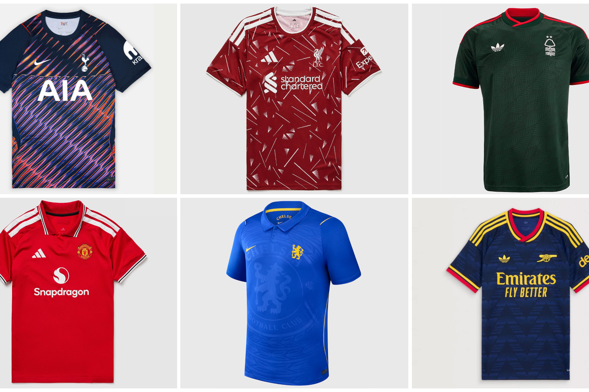
The start of the new Premier League season brings with it fresh threads across the top flight, and as ever there is an assortment of offerings.
Some are magnificent pieces of design, sartorial artworks which will be admired for years to come. Others are deeply misguided creations which should not have seen the light of day.
Here, we run the rule over this season’s home and away editions. From worst to best, here are the Premier League 2026/27 kits, ranked and rated:
40. Newcastle home
The barcode effect is going to damage retinas. Newcastle’s home shirt should just be simple, uniform black and white stripes – there was no need to get tricky.
39. Bournemouth home
The giant Vitality sponsor is an eyesore and the black framing makes it impossible to ignore.
38. Sunderland away
Some will like this. Not me – it’s odd, it’s ugly.
37. Fulham away
It looks like an oil spillage.
36. Manchester City home
The strange fade into white shorts doesn’t look great, particularly from a distance.
35. Nottingham Forest home
Never a fan of these psychedelic background patterns – there were a few at the World Cup – and this is another example of the genre.
34. Crystal Palace away
Shiny black feathers? No thanks.
33. Everton home
Not bad but not convinced the flecks of yellow work here.
32. Aston Villa away
The background swirl is quite fun but the very central positioning of everything on the front of the shirt is slightly odd.
31. Fulham home
Clean and crisp, slightly dull.
30. Brentford home
Unremarkable.
29. Hull away
Bold shoulders. Too bold?
28. Manchester United home
The collar is smart but otherwise this kit evokes no strong feelings.
27. Coventry home
We prefer Coventry in solid sky blue but this is an attractive looking striped shirt.
26. Tottenham home
Like Fulham, simple, effective, if a bit unspectacular.
25. Coventry away
Nothing to dislike here.
24. Bournemouth away
I really like the background pattern and colour (may be on my own here, admittedly) but once again the gargantuan pink sponsor takes away from the overall aesthetic.
23. Brighton home
Zoom in and they are actually dotted lines, which is unusual. Essentially this shirt is saying, ‘cut here’.
22. Brighton away
Much the same as the home edition.
21. Tottenham away
Bold, intriguing.
20. Manchester City away
Pleasant enough.
19. Hull home
It’s nice to see a retro kit, although this one does seem particularly, intensely dated. It’s the lettered crest that looks a little bizarre, I think.
18. Leeds home
A rare horizontal stripe for a home shirt in the Premier League. We like it.
17. Newcastle away
We quite enjoy the castle motif in the background, and the old-school club crest.
16. Everton away
Simple colours and a sharp design.
15. Nottingham Forest away
A bold dark green, which makes the red shoulders and neckline stand out.
14. Chelsea home
The background badge is garish, but actually this is a really sharp look when viewed from a distance, with golden flecks on the crest, Nike tick and shoulder trim.
13. Ipswich away
The colour is lovely, and the whole effort is an unusual twist.
12. Crystal Palace home
We like a sash, and this one has got a lot going on with the dual colours and various white lines. Altogether, a good look.
11. Aston Villa home
This is a simple, classy offering from Villa.
10. Leeds away
Bright! But a lovely shade.
9. Liverpool away
A stirring evocation of the 1980s.
8. Chelsea away
This kit is great, with a gold-leaf trim elevating the intimidating black base.
7. Manchester United away
A thrilling shade of electric blue.
6. Arsenal home
The details in the sleeve trim and collar add a nice touch to a very smart shirt.
5. Ipswich home
Umbro rarely miss and this is an eye-catching background pattern. The enormous sponsor is unnecessary, but it’s otherwise a great addition to the Premier League.
4. Brentford away
This is inspired by the Kingsman movies, apparently, after the director Matthew Vaughn bought shares in the club. The pinstripes look lovely.
3. Sunderland home
Hummel with a strong entrant, designing this very nice retro shirt – the best of the oldies.
2. Liverpool home
We really like this. Jazzy.
1. Arsenal away
It’s a really striking take on the “bruised banana” kit of old and we love it all – the background pattern, the colours, the club crest. We have our champion.
Please do tell us where we went badly wrong in the comments below.